Nordstrom Notifications
Redesigning Notification Settings
OVERVIEW
SUMMARY
The Problem: Based off our Notification Vision Workshop and evaluative research report, the biggest pain point of the Nordstrom Notification experience was customers’ inability to understand the Notification Settings screen.
The Solution: Goal is to revise the information hierarchy of Notification settings to create improved clarity and understanding of the relationship between Notification Topics (i.e. Price Drop, Back in Stock) and Item Locations (i.e. Wish List, Saved for Later, Shopping Bag).
The Process: Conducted a competitive analysis to understand industry best practices for notification designs, and explore what other unique value competitors offer to their customers. Explored and iterated through a few concepts before narrowing down to 1 or 2 viable options. Partnered with UX Research to Concept Test the solutions with 12 real Nordstrom Customers. Iterated based on customer feedback and delivered high-fidelity comps to engineering. This feature is currently live!
NOTIFICATION PAIN POINTS
Based on our evaluative research, we were able to discover some customer pain points with the current Nordstrom app notification experience:
When Notifications are off, it conveys an all-or-nothing experience
Customers were generally unsure if they could customize their notifications - awareness problem
When on Notification Settings screen, customers were confused how Item Notification types and Item Locations were related to each other.
CURRENT NOTIFICATION EXPERIENCE
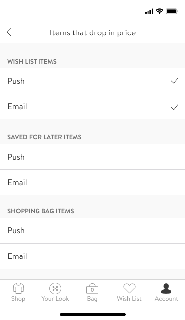
Concept 1: Long page scroll with notifications organized by Location first, then Topic.
My Role: UX Designer II
Tools: Figma
Artifacts: Competitive Analysis, High-fidelity comps, Concept Testing
COMPETITIVE ANALYSIS
In addition to the evaluative research, I conducted a competitive analysis in order to:
Gain an understanding of industry best practices around notification design
Discover unique features competitors are utilizing to offer additional value to their users
How does Nordstrom stack up?
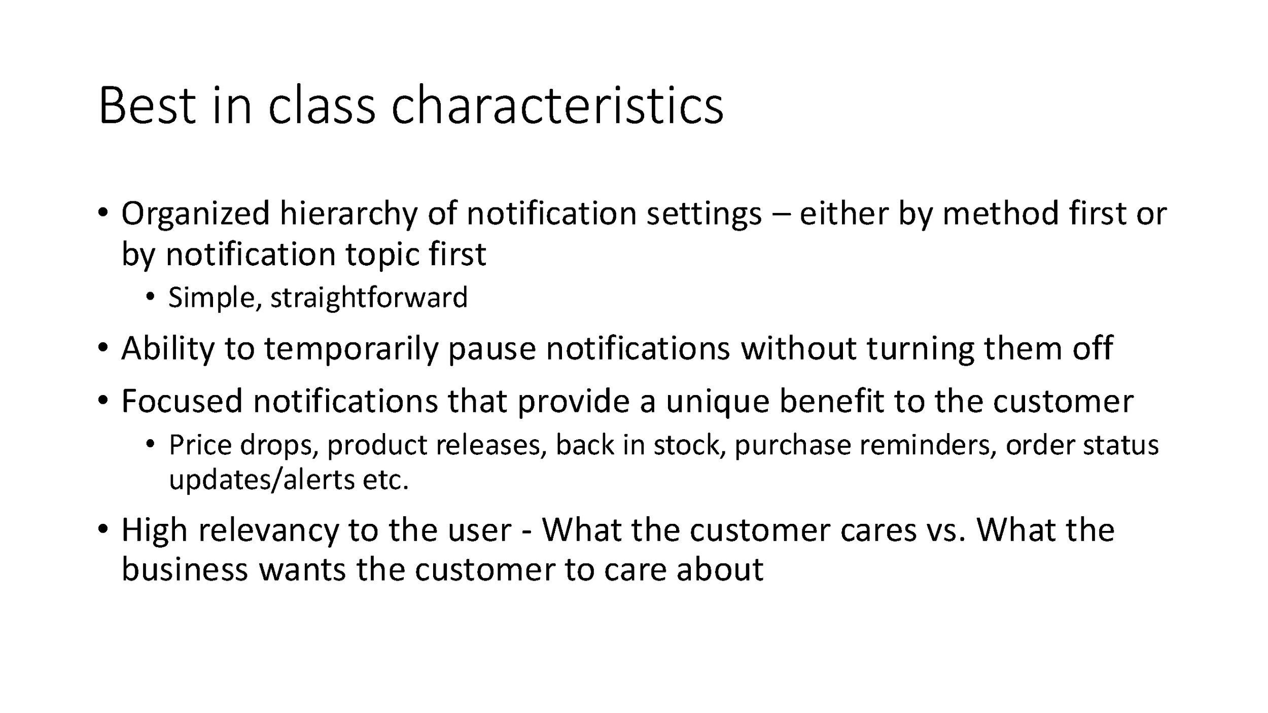
What are some “Best in Class” characteristics?
I studied 14 different competitors across 4 industries: social media apps, work management tools, crypto/finance apps, and of course, other retail competitors such as Amazon and Nike.
RESULTS SUMMARY
DESIGN
EARLY EXPLORATIONS
VIABLE CONCEPTS
After exploring some ideas, I finalized my designs down to two viable concepts:
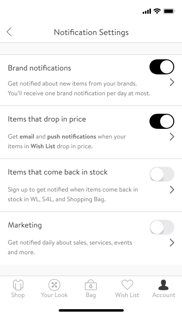
Concept 2: Split into two pages, notifications organized by Topic first, then Location.
CONCEPT TESTING
In order to validate the designs, I partnered with UX Research to conduct a Concept Test, where we asked real life Nordstrom shoppers to evaluate the two concepts and the current, live Nordstrom notification experience. The test was during the COVID pandemic, so all sessions were over video calls.
Participants walked through the 3 concepts in randomized order:
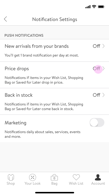
Current live Notification Settings screen
Design concept 1
Design concept 2
Side by side comparison
After each concept, participants were asked to share their thoughts on the clarity, customization, and preference of each concept
Participants were also asked to rate their satisfaction level after each concept
Almost all participants disliked the first concept which was Nordstrom’s current Notification Settings experience
Almost all participants preferred Concept 1 OR Concept 2 over the live experience; all felt that one of these two established a more clear relationship between notification topics and locations.
Participants were split on their choice between Concept 1 or Concept 2, mostly because of visual preference (i.e. visually compact vs longer/clearer design)
For Concept 2, some participants did not notice the carat/arrow that took them to the second page of the experience.
Also in Concept 2, some participants failed to notice dynamic text/copy that informed them of the preferences they just saved.
RECOMMENDATIONS
UX Research recommended that the team move forward with Concept 2, but also suggested to iterate on the design in order to improve clarity. UX Research also referenced previous research to inform the best information hierarchy design, which was to organize by Notification Topic first before Location.


