Amazon: FinTech GRACE Tool
As a UX Design Intern at Amazon, I led the end-to-end experience for a proprietary finance tool.
OVERVIEW
The Challenge
Today, accountants are using Excel sheets to calculate and keep track of rates and reserves. This is a tedious, manual process that results in over 250 manual journal entries and over 600 hours of work each month. To top it off, accountants have to repeat this process every month in a 5 day crunch.
The challenge was to design an end-to-end user experience for a developing finance tool to help accountants quickly calculate rates and reserves accurately.
My goal was to design a Dashboard and Reserve experience to make accountants’ 5-day crunch easier.
The Solution
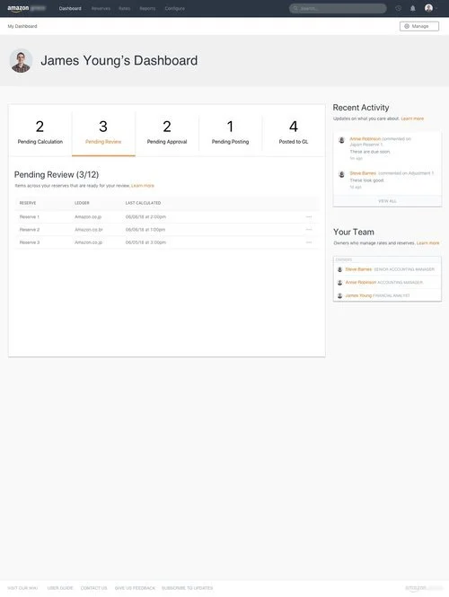
My solution was to design the main navigation, analyzation, and approval processes, for 2 major user roles called the Approver and the Preparer. This included designing the following screens:
Dashboard
Approval process
Reserve List
Reserve Details
Calculate Reserve
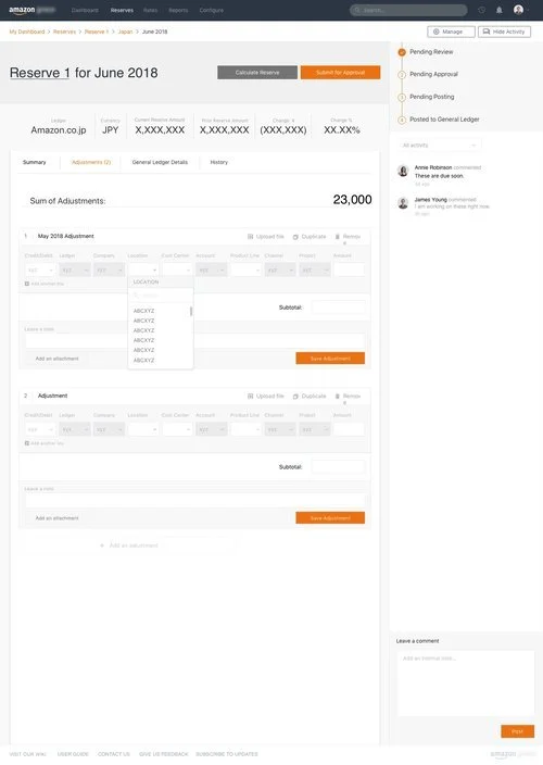
Adjustments
RESEARCH + ANALYSIS
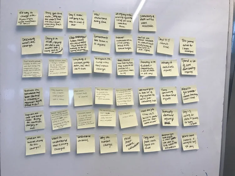
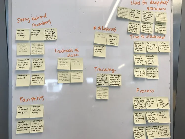
Conducted a total of 11 interviews with both customers (accountants and finance managers) and stakeholders (developers). Created an affinity diagram to analyze results and draw out key research points.
Also based on the interviews, I created a customer journey map in order to understand the current experience accountants go through today in calculating reserves and rates using manual Excel sheets.
KEY FINDINGS
From the Affinity Diagram and the Customer Journey Map, I found the following key research points:
Manual process through Excel sheet
“Half the job is how do I build a smarter Excel file”
40 different known reserves
90+ Journal entries for 3 team members
12 regions x 30 min = 6 hours of work
Inability to understand current status of reserve
Inability to communicate with product owners because of lack of granularity in Excel
“We want to understand what is driving the changes behind the number but we never get to this explanation because we spend all our time calculating.”
These research points helped me create Design Goals to help guide the overall design direction for the new finance tool.
Design Goals
Increase transparency behind calculated numbers
Create features for accountants to dive deeper
Help accountants tell a better story around their numbers
PERSONAS
In my research, I also came across 2 major user roles that would be using the finance tool the most: Approvers and Preparers. Preparers are Financial Analysts who are actively analyzing and calculating reserves, and need approval from Approvers before successfully posting a reserve to the general ledger.
Approvers are Senior Accounting Managers who need to be able to monitor a wider set of reserves, monitor any Preparer’s underneath them, and crucially review and approve any submitted reserves before posting. Based on this information, I was able to create two main personas below:
Preparer: James Young
Job title: Financial Analyst
Responsibilities: Calculate reserves, responsible for presenting to stakeholders about calculations, responsible for Brazil and Japan reserves.
My Role: UX Design Intern
Duration: 12 weeks
Tools: Pen, paper, SketchApp, Invision
My Artifacts: Affinity Diagram, Customer Journey Map, Storyboard, User flows, Sketches, Low-Fi mockups, High-fi mockups, Digital Prototype
Team: Worked under the guidance of a Manager and a mentor, and worked closely with the development team (~8 individuals)
Approver: Annie Robinson
Job title: Accounting Manager
Responsibilities: Oversee James’ work, review and approve reserve calculations, responsible for western Pacific countries’ reserves.
DESIGN: USER FLOWS + SKETCHES
User Flows
After understanding the problem space and defining my personas, I started crafting a solution by first creating user flows to understand how the new finance tool can improve my customers’ processes.
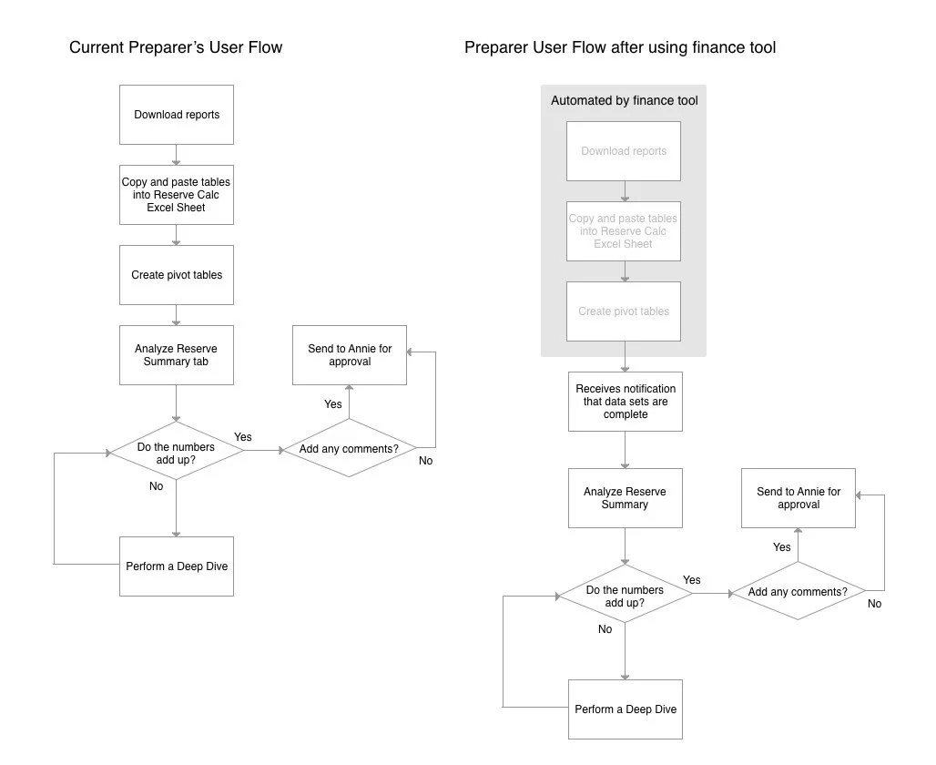
In particular, this is a pair of user flows that studies the Preparer’s decision-making process. The user flow on the left reflects decisions when using the manual Excel sheets to calculate reserves. On the right, is the same Preparer’s flow but with the finance tool automating the first three steps. Having the first 3 steps automated frees the user to spend more time analyzing the numbers, rather than wasting time doing the pre-calculations.
Sketching
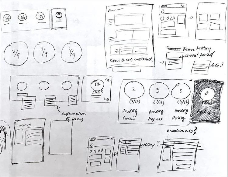
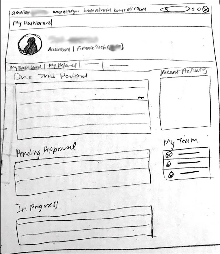
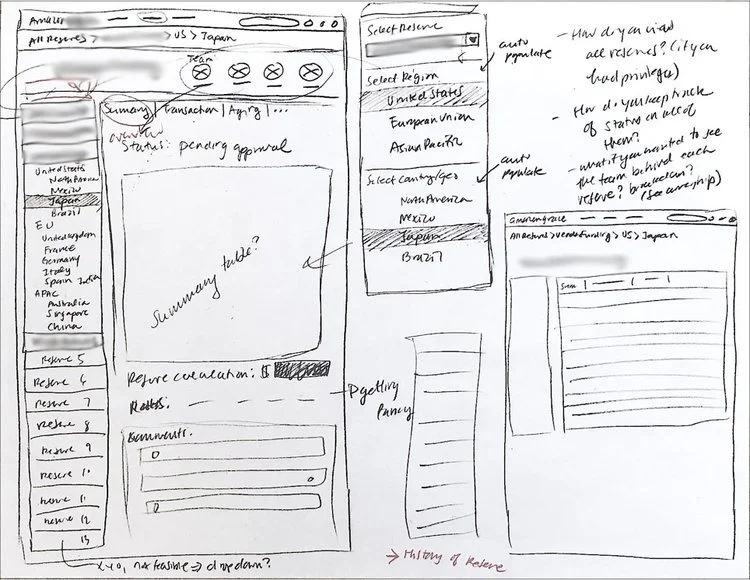
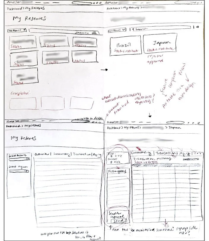
After understanding what the new finance tool can do to improve on accountant’s processes, I started sketching different wireframes for what the interface would look like. Below is a series of sketches I created imagining what key screens would look like, such as the Dashboard and the Reserve screens.
Sketches of Dashboard screen
A sketch of what the Dashboard could look like
Sketches of Reserves screen
Various sketches of Reserve screens
DESIGN: WIREFRAMES
Early Wireframes
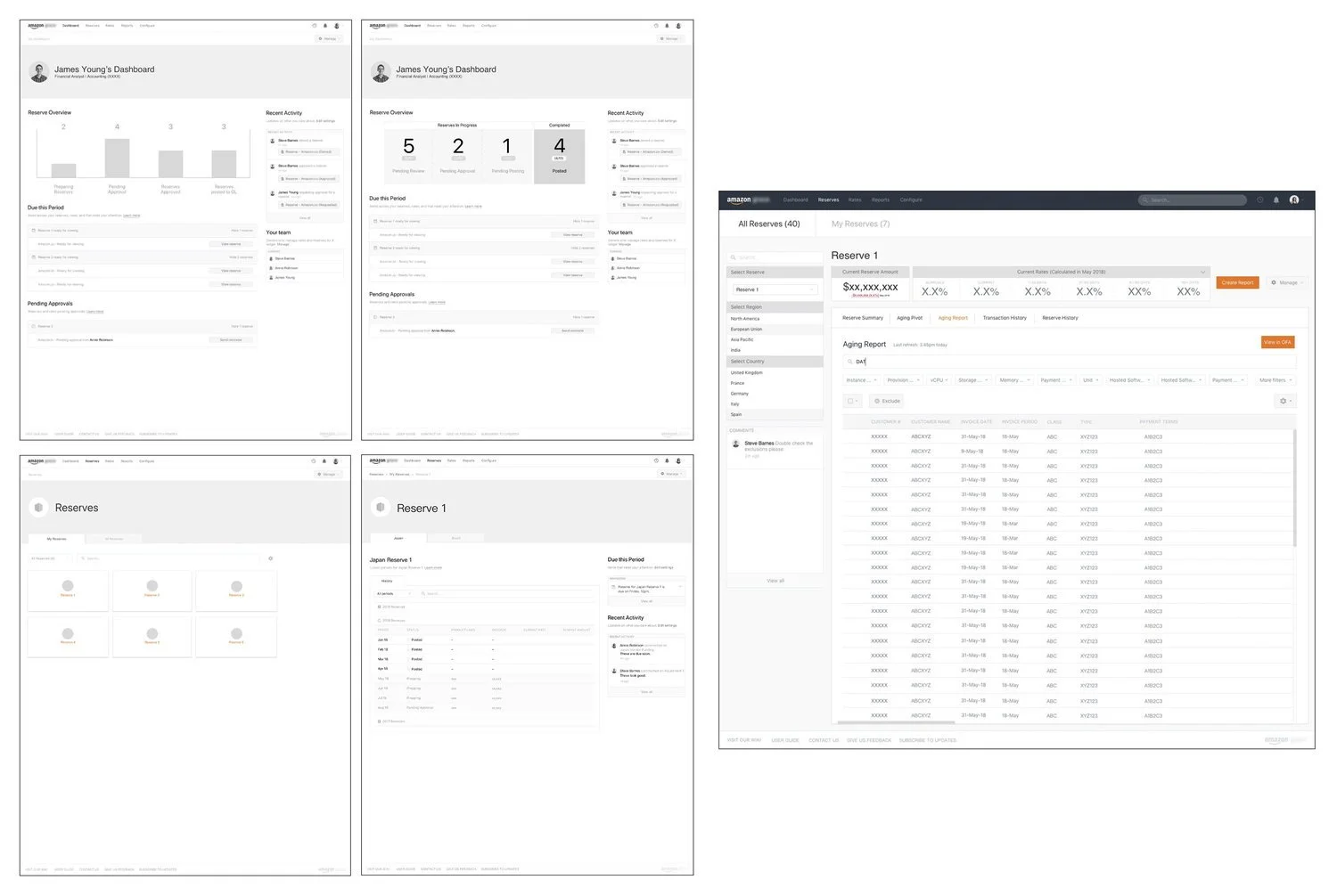
After sketching out rough ideas, I created some initial wireframes using Sketch. Below are some of the early wireframes I designed, the dashboard, reserve navigation and the reserve details screen.
After refining some of these initial wireframes, I created a digital prototype using Invision. This digital prototype mimicked how the program would work in real-life, and it served as a tool in my usability tests with customers.
USABILITY TESTING + ITERATIONS
Usability Tests
After creating the high-fidelity mockups and an interactive digital prototype, I conducted 2 rounds of task-oriented Usability tests. These test focused on the Preparer’s & Approver’s user experience by testing the navigation and approver’s workflow.
In total, I was able to recruit 11 Participants in total, ranging from Financial Analysts to Senior Accounting Managers, customers who would be directly using the finance tool on a monthly bases. Participants ranged from 4 different Reserve Divisions from within Amazon, and some were located in other geographical areas including London, Beijing and Cork.
Usability tests lasted around 1 hour for each participant.
Iterations
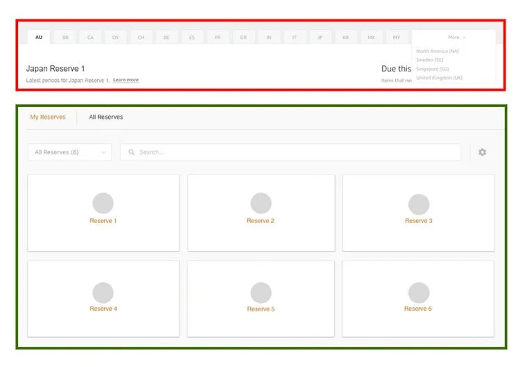
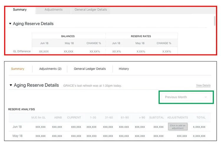
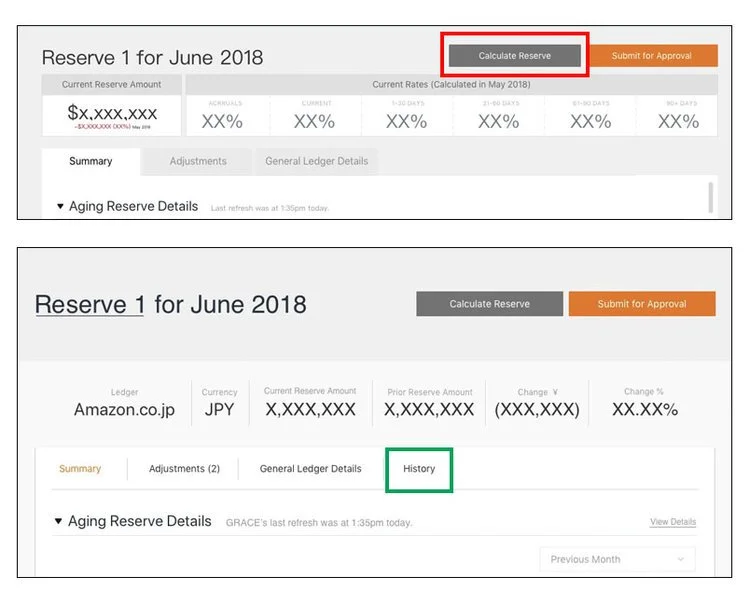
After collecting resulting data from each usability test, I analyzed user responses to understand what alterations or changes I should make to the product. Below are a series of images that show design iterations/changes I made based on customer feedback. “Before” images are outlined in red, and “After” are marked in green.
Overview Graphic
This feature was designed to give users a “lay-of-the-land” approach to all reserves across the company. It’s purpose was to give users an illustrative/visual way to capture the statuses of all reserves at once.
When tested, customers expressed their desire for the graphic to be “dynamic” - be action-oriented and clickable to see all individual reserves listed under a specific status-category.
I edited this feature to create a list of reserves that would appear on the bottom depending on what status button was clicked, giving customers an “overall picture.”
Reserve Organization + Navigation
Interestingly, customers were split 50/50 on whether they preferred a tabular navigation process (illustrated in red), or a “card” navigation process (illustrated in green).
To break the tie, I advocated for the card navigation process, because as Amazon grows and adds more reserves and countries, it will be much easier to manage a larger quantity of cards than it is to manage a large quantity of tabs in a limited space. In the future, management of these cards could include filtering options or search options.
Look-Back Periods
80% of customers expressed their need for the ability to compare a reserve’s current calculations with previous posted (final) calculations in past months, or “Look-back” periods. Customers cited that to understand the health of a reserve, it was important to track a reserve’s progress over time.
I created a drop down option to let customers choose from a variety of look-back periods, such as “Previous month", or “Previous quarter,” or “Previous year.” This would give the customers the ability to compare current calculations with a previous month’s final calculations.
Calculation History
From the usability tests, I found that no customers were able to remember previous calculation “refreshes" - calculations that are automatically made by the program every so often during the 5-day crunch. This recall is important because accountants need to be wary of any drastic changes in calculations during this 5-day crunch.
The solution to this problem was to add a “History” tab in the secondary navigation, which would list all the previous refreshes, so an accountant can keep a better eye on the fluidity of the reserve.
FINAL DESIGN
After consolidating data points from the usability tests, and going through some design iterations, I was able to incorporate all my customer feedback into a final mock-up design. Below is a sample of some of the final designs I created:
Final Design - Preparer Role
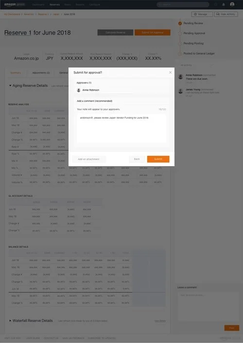
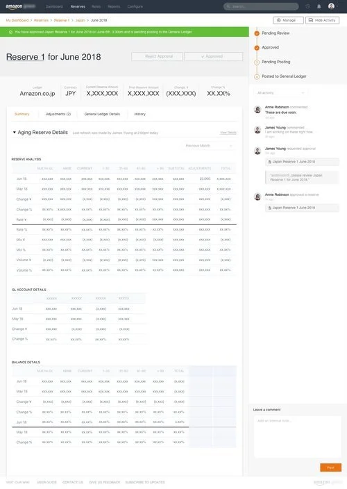
Screens showing the Preparer navigating to the correct reserve, making adjustments, and finally submitting the reserve for approval with a comment.
Final Design - Approver Role
Screens showing the Approver’s approval process.
NEW FEATURE SURVEY + NEXT STEPS
New Feature Survey
During my usability tests, my customers gave me great new feature suggestions for the next design iteration for the finance tool. I received the following innovative suggestions:
Parallel Approvers, switching approvers
Flagging in Reserve Overview
Auto-scheduling, bulk refresh actions
Reserve Overview page
Information on Cards (status, code #)
I took these suggestions and created a “New Feature Survey,” and handed these sheets out to both my customers and development team, in order to prioritize which features to implement in the next design phase.
The survey allowed stakeholders to evaluate each feature on a scale of 1 - 5 for cost (how much will it take to implement?) and impact to the user (how useful is it to our customer?).
Based on the feedback from my stakeholders, I was able to steer the direction of the project by ranking which feature was most important to develop first.
Next Steps:
As my internship neared its end, I decided to brainstorm future design considerations for the product to leave behind after my departure. While a lot of the core interactions were designed, there were plenty of ways this tool could be further refined in the future. My suggestions for the next stage of design iterations included the following:
When does a user know that a Reserve is
“ready for review?”Reserve “Overview” Page
Approver privilege settings
New Feature List (from above survey)
Executive Approver, Configurator user roles
Adjustments for other accounting teams
Investigate Sum of Adjustments Summary
Investigate Credit/Debit Lines
Investigate further on “History” tab
History of prior refreshes
History of posted reserves
THINGS I LEARNED FROM MY TIME AT AMAZON
My time at Amazon’s Finance Technology was an amazing experience, I learned so much in such a short amount of time. Here are some key takeaways that I learned:
Scalability: Creating designs that are scalable for larger number of users. This is an important quality to keep in mind as a designer because at many companies like Amazon —where their customer base is in the millions— scalability is a big issue in being able to properly serve your customer base.
Reusability: It is incredibly important to design elements that can easily be reused or repurposed. This can help so much in reducing workloads and in increasing productivity. It can also create familiar patterns for users that require less time to adjust.
Leading and advocating for the UX vision: The most important thing I learned is to get your stakeholders’ buy in. Communicating and educating your stakeholders about user needs helps them understand the reasoning behind the design decisions you made, and your stakeholders will begin to understand the importance of UX.
I also learned that User Experience Design CAN influence the direction of an entire project. Towards the end of my internship, I was able to influence the project’s heading with my “New Feature Survey.” By prioritizing which features were the most important the user, I was able to provide a mini “road map” for the developers and help define what shape the Amazon tool would take.
